Add sponsors to your Starlight site
Many open-source projects are sponsored by companies in their fields. Using Starlight component overrides, you can add custom content to showcase sponsors directly in your documentation.
In this guide, you’ll implement a sponsors component using component overrides.
Prerequisites
This guide assumes you have an existing Starlight project. If you don’t have an existing project, you can check out the getting started documentation, or run the following command to create a new site.
npm create astro@latest -- --template starlightCreate the Sponsors component
This component is inspired by the sponsors component in the Vite documentation, located under the table of contents. Feel free to customise it to your liking, and add your own sponsors and images to the component.
---import { Image } from 'astro:assets'import example1Logo from '../assets/example1.svg'import example2Logo from '../assets/example2.svg'import example3Logo from '../assets/example3.svg'
const sponsors = [ { name: 'Example', img: example1Logo, url: 'https://example.com', size: 'large' }, { name: 'Example', img: example2Logo, url: 'https://example.com' }, { name: 'Example', img: example3Logo, url: 'https://example.com' },]---
<section> {sponsors.map(sponsor => ( <a href={sponsor.url} class={sponsor.size ?? ''}> <article> <h4>{sponsor.name}</h4> <Image height={sponsor.size === 'large' ? 24 : 12} src={sponsor.img} alt={sponsor.name}/> </article> </a> ))}</section>
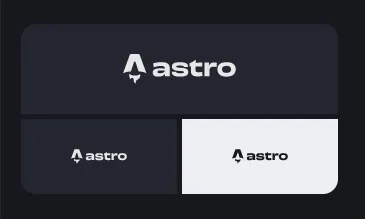
<style> section { display: flex; flex-wrap: wrap; border-radius: 0.75rem; overflow: hidden; gap: 0.25rem; width: 100%; margin-top: 1rem; } a { width: 34%; flex-grow: 1; } a.large { width: 100%; } article { display: flex; background-color: var(--sl-color-gray-6); justify-content: center; align-items: center; padding: 1.5rem; width: 100%; } article:hover { background-color: var(--sl-color-gray-1); } article:hover :global(img) { filter: none !important; } :root[data-theme='light'] article:hover :global(img) { filter: grayscale(1) invert(1) !important; } h4 { position: absolute; width: 1px; height: 1px; white-space: nowrap; clip: rect(0 0 0 0); clip-path: inset(50%); overflow: hidden; } :root[data-theme='dark'] article :global(img) { filter: grayscale(1) invert(1); }</style>This component should look something like this (with the hovered sponsor image inverted):
Override the TableOfContents component
Override the TableOfContents component to include the Sponsors component. You can import the builtin component from @astrojs/starlight/components/TableOfContents.astro.
---import Default from '@astrojs/starlight/components/TableOfContents.astro'import Sponsors from './Sponsors.astro'---
<Default {...Astro.props}><slot/></Default><Sponsors/>
Add the TableOfContents component to your Starlight config in astro.config.mjs to override the builtin component.
import { defineConfig } from 'astro/config';import starlight from '@astrojs/starlight';
// https://astro.build/configexport default defineConfig({  integrations: [    starlight({      title: 'My Docs',      components: {        TableOfContents: './src/components/TableOfContents.astro',      },      ...    }),  ],});
That’s all!
With that, you have a custom sponsors component to display your project’s sponsors in your docs! Make sure to check out my other Starlight recipes for more ways to customise your docs.